Welcome to GRINspiration, the online magazine for self-publishers and aspiring authors! From academic papers to fantasy novels: here you'll find tips, tricks, and insights to help you successfully write and publish your work.
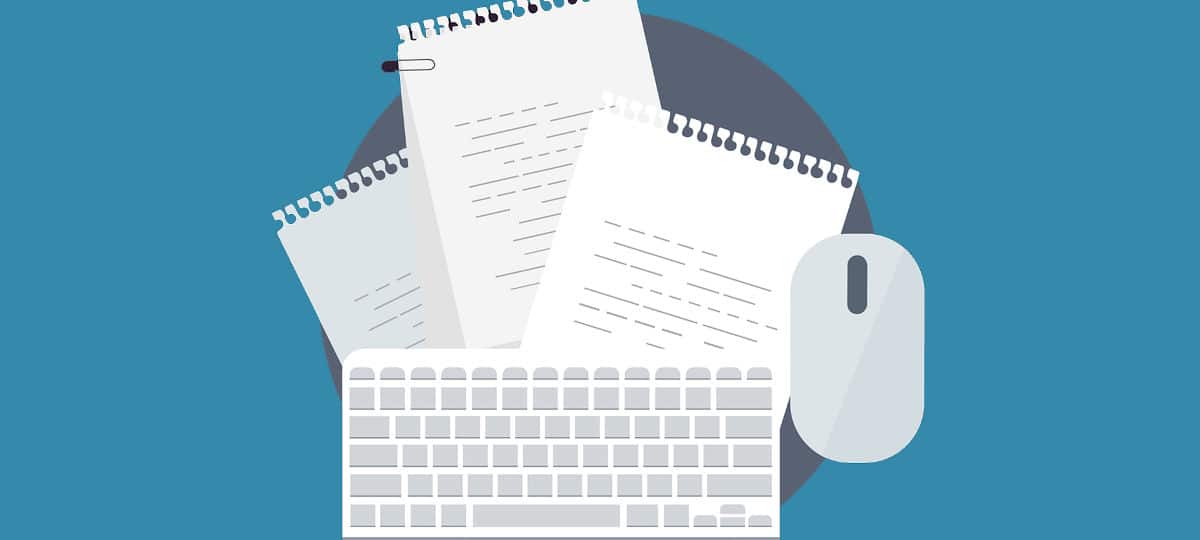
Microsoft Word remains the world's most widely used word processing software. Are you familiar with the essential formatting standards?
What to expect:
First things first:
For academic texts, justified alignment with automatic hyphenation, serif fonts, and consistent margins are recommended.
For digital texts, standards differ: left-aligned text and sans-serif fonts are more readable.
Word’s extensive features can lead to mistakes, and many users stick to the basics. This guide aims to simplify Word formatting by introducing you to key standards.
All tips are based on the latest version of Microsoft Word, included in Office 365 and Office 2019.
Justified Text: The Gold Standard?
Justified text alignment creates uniform line lengths (except for the last line of a paragraph), resulting in a clean, balanced appearance. However, it can produce uneven word spacing, so always enable automatic hyphenation alongside justified text. But don’t rely blindly on Word’s hyphenation—check hyphens manually to ensure semantic correctness.
When to use justified or left-aligned text
Left-aligned text (or ragged-right alignment) begins each line flush to the left margin, with lines ending unevenly on the right.
Use justified text for academic writing and printed materials. Its uniformity makes it easier for the eye to follow, ensuring smooth reading.
Use left-aligned text for web content. Online readers scan for relevant information, requiring less focus than printed material. Justified text, with its varying word spacing, demands more concentration and can tire readers quickly. Left-aligned text provides natural breaks for the eye, making it better suited for digital formats.
How to set text alignment and hyphenation
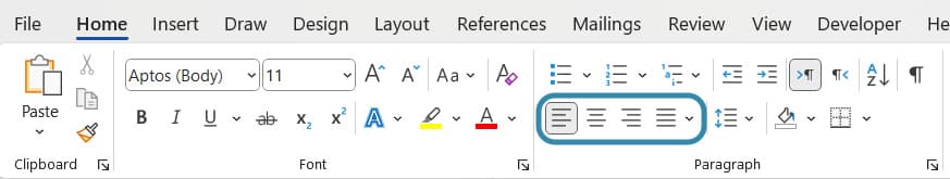
You can find much of what you need for formatting in Word under the “Home” tab.
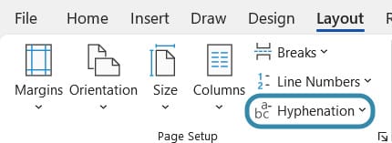
The settings for hyphenation can be found in the “Layout” tab right on the left under “Page Setup”. It is best to select “automatic”.
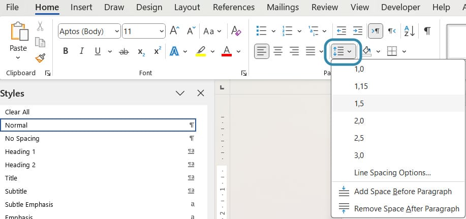
For academic texts, choose readable, professional serif fonts like Times New Roman, Garamond, or Cambria. Stick to a 12-point font size, the standard for most academic work. Use a 1.5 line spacing for better readability, preventing lines from feeling too cramped.
You can adjust font, size, and line spacing under the “Home” tab.
Serif vs. Sans-Serif Fonts
Serif fonts (e.g., Times New Roman, Garamond) feature small strokes at the ends of letters, which enhance readability and professionalism. They’re ideal for academic or printed texts and make smaller fonts easier to read.
Sans-serif fonts (e.g., Arial, Verdana, Calibri) have a modern feel and are better suited for digital content, especially on low-resolution screens where serifs might appear distorted.
Margins and Page Layout: Keep It Consistent
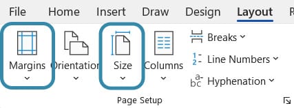
Margins: Academic texts typically use uniform margins unless otherwise specified. Word’s default settings (2.5 cm top, left, and right; 2 cm bottom) are a good choice. Adjust these under the “Layout” tab in the “Margins” menu.
Page format: The standard is DIN A4. Avoid altering this setting to ensure a familiar reading experience. You’ll find this option under the “Layout” tab in the “Size” menu.
Did you know?
Microsoft Office was the most-used office software among German employees in 2020.
A typographic rule states no more than four consecutive lines should end with a hyphen, as this disrupts the reader’s flow.
Serif fonts can increase reading speed by up to 20% compared to sans-serif fonts.
If you already have your own photo or design – or at least a very clear idea of what your book cover should look like – perfect! We’ll take care of the design process and send you several drafts to choose from.
Don’t have a cover idea yet, or would you like us to include your author photo on the back of the book? No problem at all. Based on your book’s description, we’ll search for suitable visual concepts and design your individual book cover – including your author photo on the cover – creative, professional, and tailored to your story.
Need some inspiration? Here are some of our finest covers:
Softcover or Hardcover
The choice is yours: decide between a classic softcover edition or a premium hardcover binding. We’ve summarized the key advantages and disadvantages for you:
Softcover
Hardcover
Production Costs
Lower than hardcover, allowing for a more attractive retail price
Higher production costs, which result in a higher retail price
Format
Lighter, fits more easily into your bag, and is more convenient on the go
Heavier and bulkier, therefore less suitable for travel or casual reading
Perceived Value
Feels less premium and is less eye-catching than a hardcover
Creates a high-quality impression, better suited as a gift or collector’s item; appears more prestigious
Durability
Corners bend more easily and the spine may break sooner
More durable cover, better shape retention, and improved protection for the pages
Layout check
We check your text for readability and printability (Are the margins sufficient for printing? Is the font size easy to read in print? Is the line spacing right? Is the resolution of the illustrations sufficient for good print quality?), embed the fonts if necessary and take care of automatic page numbers and a table of contents.
Publication as e-book and ISBN
With each publication, you will receive an ISBN number for your e-book and print book.
Worldwide distribution
With each publication, you will receive an ISBN number for your e-book and print book. We deliver your book to our worldwide distribution network: over 300 online shops.
Appealing blurb
We will write you a blurb that arouses curiosity and emotions – and convinces readers. Perfectly tailored to your genre and target audience.
Personal contact
Benefit from our many years of publishing experience: We support you with our know-how from upload to finished book. With us, you will get a personal contact person, we will guide you step by step through the entire process and are there for you.
Layout Deluxe
Your book, perfectly staged: With professional typography, stylish book typesetting and design templates that fit your project, we ensure an all-round coherent reading experience. Whether classic or individual – we design your book the way your story deserves it.
Cover Service
Do you already have your own photo or motif or at least a very concrete idea of how you imagine your book cover? Perfect! We will take care of the creation and send you two to four drafts, from which you can choose one.
You don’t have a cover idea yet or would like us to include your author photo on the back of the book? No problem. For an extra charge of €50, our graphic designer will search for motifs and design your individual book cover including an author’s photo on the book cover – creatively, professionally and matching your story.
Need some inspiration? Check out some of our favorite covers!
Fee overview
Each sale of your title will be remunerated according to the following table.
You will receive your royalties on top of the publisher's selling price. The table has been valid since 17.04.2025, 12.30 p.m.
Fee on e-book sales
www.grin.com50%
Amazon Kindle, iBook Store, Google Play, Ciando,
Pubbles, Libri, Genios, Other Distributors30%
Fee on book sales
www.grin.com50%
Book trade (BoD and Amazon Marketplace)30%
The publisher's selling price is the sales price excluding the statutory value added tax as well as less trade discounts, production and shipping costs.
The selling price can be determined individually by the respective dealer, unless the nationally bound selling price is required by law (book price fixing).