First things first:
- Less is more – don’t divide your text into too many sections. The rule is: one thought = one paragraph.
- Avoid widows and orphans.
- Use soft and hard breaks intentionally.
Many people either use too many or too few paragraphs in their texts, leaving readers with either a bunch of short sections or one massive block of text. Neither is ideal. A paragraph should complete a thought, so you can start the next one. It can also be used to highlight a different perspective or add more information to a topic you’ve already discussed.
For readers, logical paragraphs are crucial because they make the text easier to understand and remember. Paragraphs can break down your text in a way that makes it more readable and engaging.
All the tips here apply to the current version of Microsoft Word included in Office 365.
The aesthetics of paragraphs: widows and orphans
When formatting paragraphs, there are some basic rules to prevent an unsightly text flow. Two terms you should know are “widow” and “orphan.” You’ve probably seen them before:
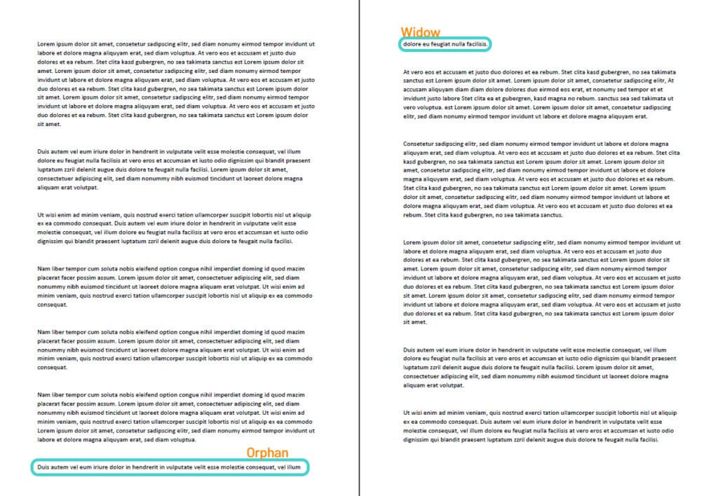
- Orphans are the first line of a new paragraph that ends up alone at the bottom of a page.
- Widows are the last line of a paragraph that ends up alone at the top of a new page.
To illustrate:

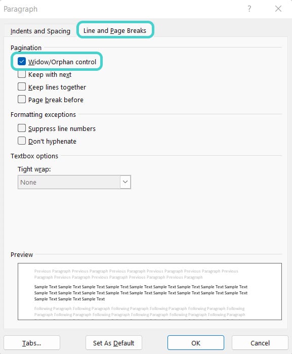
Using Microsoft Word, you can easily avoid these formatting faux pas. Highlight the paragraph you want to keep together, go to the “Paragraph” settings in the “Home” tab, and click on the small arrow in the bottom-right corner. In the context menu, switch to the “Line and Page Breaks” tab and check the box for “Widow/Orphan Control.”


This setting ensures that Word keeps at least two lines of a paragraph together. But sometimes that’s not enough because there’s another rule: headings should only appear at the end of a page if there are at least three lines of text that follow. To avoid having a heading alone at the bottom of a page or followed by only a line or two of text, use a page break before the heading. You can find the “Breaks” option in the “Layout” tab under “Page Setup,” or just use the keyboard shortcut Ctrl + Enter.
More aesthetics: hard vs. soft line breaks
Depending on your page layout, Word automatically sets a specific line length. If a word exceeds this length, Word will automatically move it to the next line. In addition to this automatic feature, you can also manually set soft and hard line breaks. But do you know the difference?
Hard line breaks are created using the Enter key. This starts a new paragraph and completes the previous thought. In lists, this key creates a new list item, with Word automatically generating a new bullet or number.
Soft line breaks only end the current line without starting a new paragraph. You can create a soft line break with Shift + Enter. This is useful in address blocks or poems but can also be handy in regular text. However, be careful: if your paragraph is justified, a soft line break can create big gaps between words. There’s a simple trick for this: insert a tab stop before the break to maintain the spacing.
Here’s what it looks like when using a soft line break in a list:
- Example line 1
- separated by Enter from example line 2,
but by a soft line break from example line 3.
As you can see, Word doesn’t add a new bullet point. Try experimenting with the different options—it’s not as complicated as it might seem!
More rules for line breaks
- Avoid breaking abbreviations: for example, “e.g.” shouldn’t be split between lines. Use a “non-breaking space” (Ctrl + Shift + Space) to keep them together. The same goes for dates or times.
- Don’t split single words that have been emphasized (bold, italic, colored, small caps, or uppercase) as it ruins the effect.
- Dashes and quotation marks shouldn’t stand alone at the beginning or end of a line.
- Don’t separate a percentage or currency symbol from its value. This applies to all measurements and units.
- Don’t separate initials from the last name (e.g., J.R.R. Tolkien). The same goes for academic titles (e.g., Dr. Smith). Even Walther von der Vogelweide would appreciate it if his name stayed on one line—and if that’s not possible, make sure to keep prefixes like “von” or “de” from being left at the end of a line.
- Don’t separate house numbers from street names or zip codes from cities.
- And in general: if it feels wrong to split something across lines, trust your gut—it’s usually right!
Happy formatting!


