Welcome to GRINspiration, the online magazine for self-publishers and aspiring authors! From academic papers to fantasy novels: here you'll find tips, tricks, and insights to help you successfully write and publish your work.
With Microsoft Word, you can design text in a variety of ways. But when is it appropriate to use text formatting, and when does it detract from the overall appearance?
First things first:
Text formatting can be categorized as bold or subtle, depending on the desired effect.
Mixing fonts can enhance readability.
Less is more: Text formatting should highlight information and be used sparingly.
In Word, you can adjust font style and size or apply formatting such as bold, italic, underline, strikethrough, subscript, superscript, indents, colors, or even set text to all uppercase. This article shows you how to apply these formats and when it’s best to avoid them.
All tips provided here apply to the latest versions of Microsoft Word included in Office 365 and Office 2019.
Bold Text: An Attention Grabber
In typography, font weight refers to the “stroke width” of printed or virtual letters and characters. Many font families offer variations that incorporate different weights (regular or bold), widths (narrow or wide spacing between letters), or styles (regular or italic), such as Arial, Arial Narrow, and Arial Black.
The weight you choose impacts the text’s readability. The closer the letters are together, the darker the typeface becomes. Conversely, thinner fonts or excessive letter spacing create a lighter look, which can be harder to read.
Avoid formatting entire paragraphs in bold. Instead, use it for individual words or short phrases.
Italic Text: Slowing Down the Reader
Font posture refers to the straight or slanted orientation of a font, measured by the vertical stroke of the letters. Slanted fonts are referred to as italic.
Italicized text is generally harder and slower to read than regular text. To maintain readability, avoid using italics for long passages.
How to Format Text in Word
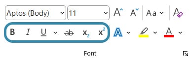
Everything you need to visually emphasize sections of your text can be found in Microsoft Word’s “Home” tab under “Font” on the left. Highlight the words or sections you want to format and click the corresponding icon.
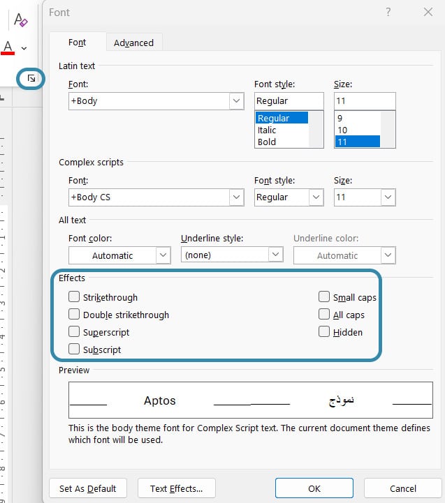
Additional text effects can be accessed by clicking the small arrow in the lower-right corner of the font menu.
Here, you can also specify whether the highlighted text should appear in small caps or ALL CAPS. For the latter, Windows users can use a handy shortcut: press Shift and F3 simultaneously to quickly toggle uppercase formatting on or off.
Bold, underlined, or colored words stand out from a passage of text before the eye has even reached the line in question. These are called “bold formatting” styles. In contrast, readers don’t notice the “subtle formatting” until the eye is in the line in question. Subtle formatting blends harmoniously into the text and can be achieved by italicizing or using small caps.
Since these styles produce distinct effects, avoid mixing bold and subtle formatting, as this creates typographical redundancy.
Mixing Fonts: Does It Make Sense?
Writing a lengthy text involves significant effort, whether it’s a research paper or a crime novel. However, engaging readers requires more than just good content—the text should also be well-structured and visually appealing.
One way to add structure is by mixing fonts. For instance, you could use a different font for headings than for body text. Quotes, captions, or footnotes can also stand out with distinct fonts. Studies show that mixed fonts facilitate skimming by helping the eye grasp text structure more effectively.
How to Mix Fonts
A basic rule, especially for academic texts, is to never mix more than two or three fonts. Using too many fonts can make your text look chaotic and disrupt the reading flow.
Microsoft Word offers a broad selection of pre-installed fonts. To achieve a cohesive look, stick to fonts from the same family. For example, the “Lucida” family includes serif and sans-serif options.
If you prefer to combine fonts from different families, ensure they contrast significantly. Serif fonts like Times New Roman and Garamond are too similar to create the desired effect. In academic contexts, prioritize professionalism; playful script fonts might work for a novel’s headings but are inappropriate for academic papers.
Did you know?
Italic fonts without serifs are harder to read than italic fonts with serifs.
Fonts deviate from optimal readability the further their weight differs from the standard (regular) weight.
Font mixing dates back to ancient times; one of the most famous examples is the Rosetta Stone from 196 BCE.
If you already have your own photo or design – or at least a very clear idea of what your book cover should look like – perfect! We’ll take care of the design process and send you several drafts to choose from.
Don’t have a cover idea yet, or would you like us to include your author photo on the back of the book? No problem at all. Based on your book’s description, we’ll search for suitable visual concepts and design your individual book cover – including your author photo on the cover – creative, professional, and tailored to your story.
Need some inspiration? Here are some of our finest covers:
Softcover or Hardcover
The choice is yours: decide between a classic softcover edition or a premium hardcover binding. We’ve summarized the key advantages and disadvantages for you:
Softcover
Hardcover
Production Costs
Lower than hardcover, allowing for a more attractive retail price
Higher production costs, which result in a higher retail price
Format
Lighter, fits more easily into your bag, and is more convenient on the go
Heavier and bulkier, therefore less suitable for travel or casual reading
Perceived Value
Feels less premium and is less eye-catching than a hardcover
Creates a high-quality impression, better suited as a gift or collector’s item; appears more prestigious
Durability
Corners bend more easily and the spine may break sooner
More durable cover, better shape retention, and improved protection for the pages
Layout check
We check your text for readability and printability (Are the margins sufficient for printing? Is the font size easy to read in print? Is the line spacing right? Is the resolution of the illustrations sufficient for good print quality?), embed the fonts if necessary and take care of automatic page numbers and a table of contents.
Publication as e-book and ISBN
With each publication, you will receive an ISBN number for your e-book and print book.
Worldwide distribution
With each publication, you will receive an ISBN number for your e-book and print book. We deliver your book to our worldwide distribution network: over 300 online shops.
Appealing blurb
We will write you a blurb that arouses curiosity and emotions – and convinces readers. Perfectly tailored to your genre and target audience.
Personal contact
Benefit from our many years of publishing experience: We support you with our know-how from upload to finished book. With us, you will get a personal contact person, we will guide you step by step through the entire process and are there for you.
Layout Deluxe
Your book, perfectly staged: With professional typography, stylish book typesetting and design templates that fit your project, we ensure an all-round coherent reading experience. Whether classic or individual – we design your book the way your story deserves it.
Cover Service
Do you already have your own photo or motif or at least a very concrete idea of how you imagine your book cover? Perfect! We will take care of the creation and send you two to four drafts, from which you can choose one.
You don’t have a cover idea yet or would like us to include your author photo on the back of the book? No problem. For an extra charge of €50, our graphic designer will search for motifs and design your individual book cover including an author’s photo on the book cover – creatively, professionally and matching your story.
Need some inspiration? Check out some of our favorite covers!
Fee overview
Each sale of your title will be remunerated according to the following table.
You will receive your royalties on top of the publisher's selling price. The table has been valid since 17.04.2025, 12.30 p.m.
Fee on e-book sales
www.grin.com50%
Amazon Kindle, iBook Store, Google Play, Ciando,
Pubbles, Libri, Genios, Other Distributors30%
Fee on book sales
www.grin.com50%
Book trade (BoD and Amazon Marketplace)30%
The publisher's selling price is the sales price excluding the statutory value added tax as well as less trade discounts, production and shipping costs.
The selling price can be determined individually by the respective dealer, unless the nationally bound selling price is required by law (book price fixing).